
Name, description and address
On the Tour tab, open Tour Settings.
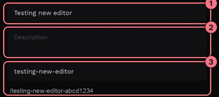
- Title (1): the tour’s name, shown to visitors and in your dashboard.
- Description (2): a few lines about the tour. Visitors see it when they choose the Info icon.
- Custom slug (3): words to put in the tour’s web address, such as 12-oak-street. The address below it shows the result: your words, then the tour’s ID.
Below these, Thumbnail is the picture shown when the tour is listed or shared; click it to change it. If you use a custom domain, Favicon sets the small icon in the browser tab.
Look and movement
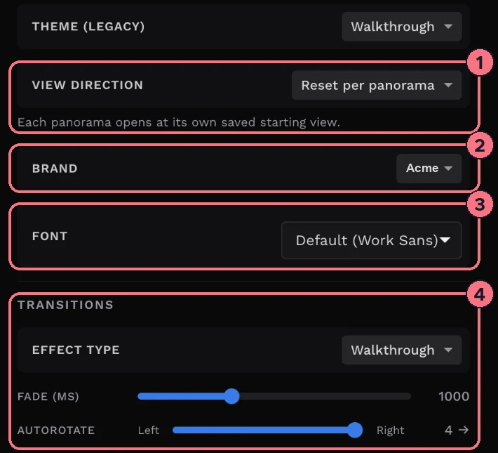
- Theme (Legacy)The older tour layouts, kept for tours made with them: Walkthrough, Listing or None.
- View Direction (1)Reset per panorama opens each panorama at its own starting view. Keep when moving keeps visitors looking the same way as they move from one panorama to the next.
- Brand (2)Applies one of your brand kits to the tour. It appears once you have a brand kit.
- Font (3)The font for the tour’s text. The default is Work Sans.
- Transitions (4)Effect Type is the animation between panoramas, such as Fade Out, Walkthrough, Zoom Out or a slide. Fade (ms) is how long it takes, from 0 to 3,000 milliseconds (3 seconds). Autorotate turns the panorama slowly on its own: move the slider left or right to choose the direction and speed (1 to 4), or to the middle for Off.
- Google AnalyticsPaste your tracking ID to see the tour’s visits in Google Analytics. More in How to set up analytics for your tours.
What visitors see: Tour UI
Open Tour UI to choose which bars and buttons appear in the tour. Each switch is on when it’s blue.
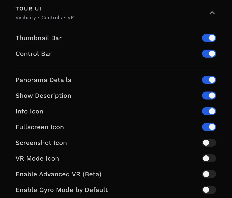
- Thumbnail BarThe strip of panorama thumbnails along the bottom. Turn it off for a cleaner view; visitors can still move between panoramas with hotspots.
- Control BarThe bar of buttons, including the floorplan, dollhouse and map buttons. Hiding it also hides those buttons, so the editor asks you to confirm. Once you’ve added the Control Bar block, Customize appears next to the switch.
- Panorama DetailsShows the panorama’s name at the top of the screen. Show Description, under it, adds the panorama’s description.
- Info IconA button that opens the tour’s title and description.
- Fullscreen IconA button that fills the screen with the tour.
- Screenshot IconA button that lets visitors save a picture of the view. It’s only listed here when the tour doesn’t use the Control Bar block.
- VR Mode IconA button for viewing the tour with a VR headset. Enable Advanced VR (Beta) turns on the newer VR mode. See VR support.
- Enable Gyro Mode by DefaultOn phones and tablets, the view follows the device as visitors turn it, from the moment the tour opens.
The Tour UI section also has background Sound and the Nadir patch that hides the tripod.
Default hotspots
The third section, Default Hotspots, sets the icon and label style that every new hotspot starts with. See Style hotspot labels and icons.
Tips
- Check after each change. Choose the eye icon at the top of the editor to preview the tour as visitors see it.
- Autorotate draws the eye on a website, where the tour sits in a page. Keep it slow (1 or 2) so it doesn’t make people dizzy.
Common questions
How do I change my virtual tour’s web address?
Type a few words into Custom slug in Tour Settings, such as 12-oak-street. The tour’s address then shows those words, followed by the tour’s ID.
How do I make a virtual tour rotate on its own?
Use Autorotate under Transitions in Tour Settings. Move the slider left or right to choose the direction and speed, from 1 to 4; the middle of the slider is Off.
Can visitors look around by moving their phone?
Yes. Turn on Enable Gyro Mode by Default in Tour UI, and on phones and tablets the view follows the device as visitors turn it, from the moment the tour opens.
How do I hide buttons from my tour?
Open Tour UI on the Tour tab and turn off the bars and buttons you don’t want, such as the Thumbnail Bar, the Info Icon or the Fullscreen Icon. Each switch saves straight away.